m16produtionz
Diamond
- Joined
- Mar 31, 2014
- Messages
- 78
- Reaction score
- 43
Personally I don't really like the new layout of the /stats I feel that it is too dull and is really tough to figure out a player's ratio compared the the old layout.
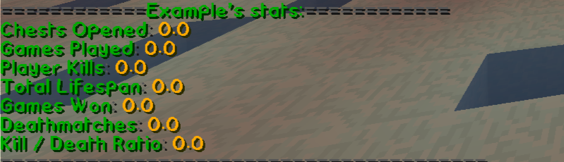
NEW LAYOUT: Tough to compare games to wins, total chests to round total etc. and it looks dull.
OLD LAYOUT: Easier to compare the ratio of wins, chests etc. and is bright. It also shows the game rank, how many points a player has and also gives the rank of the player, something the new layout doesn't have.

Please leave any feedback you have on this below! I really hope that the MCSG Staff would change back to the old layout or at least to a similar layout as it allows players to see someone's stats alot easier rather than staring at them and trying to figure out the ratio etc.
Thank you!
NEW LAYOUT: Tough to compare games to wins, total chests to round total etc. and it looks dull.
OLD LAYOUT: Easier to compare the ratio of wins, chests etc. and is bright. It also shows the game rank, how many points a player has and also gives the rank of the player, something the new layout doesn't have.
Please leave any feedback you have on this below! I really hope that the MCSG Staff would change back to the old layout or at least to a similar layout as it allows players to see someone's stats alot easier rather than staring at them and trying to figure out the ratio etc.
Thank you!
")